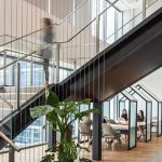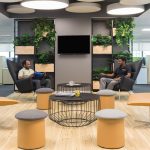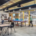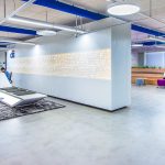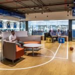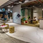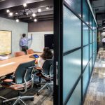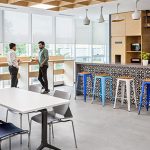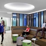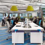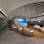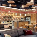
Willis Group, Mumbai

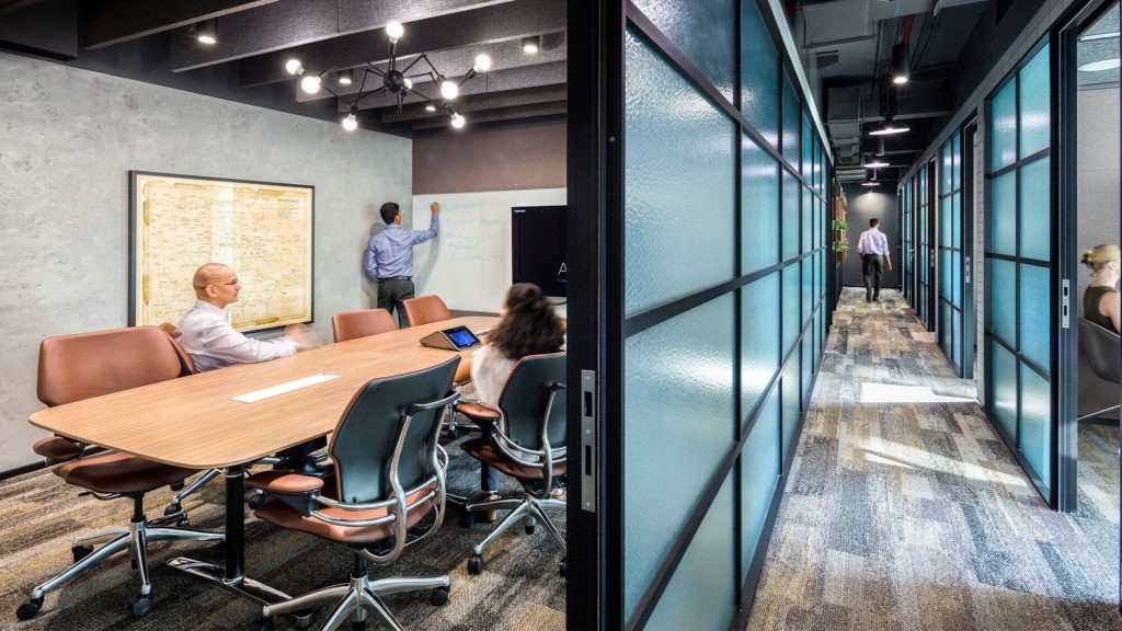
Given the nature of business, the client brief was to not only cater to a young cross section of work force, but to create a plan which accommodates the business need of 24/6 operations  and 5 shift changes per day.

The floor plate being a  homogenous spread of 130,000sft, spanning over 2 blocks, and connected by a central “sky bridge”, the biggest challenge was creating a plan which addresses the shift change, a high foot fall, connectivity between the 2 blocks, and at the same time, create an engaging workplace for the employees.

We addressed these needs by creating an “Office Landscape”, which enhances an organic geometry as against, as conventional grid planning. An hybrid layout, using linear bench, 120 degree workstations and height adjustable workstations in seamless manner, created a playful layout. Multifuctional usage of spaces was the key accommodate the business need of each shift . So while a room functioned as a cabin in a particular shift, it functioned as a 4 pax meeting room in another. Likewise a 4 pax meeting room functioned as a 4pax training room in a different shift.
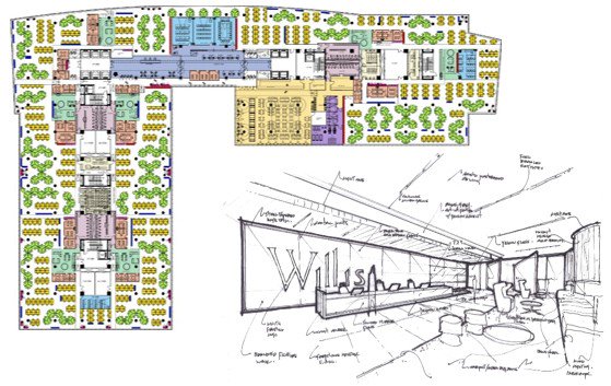
Neighborhood Planning” was applied as a basic planning principle creating 7 self-contained neighborhoods. Each neighborhood contained open and closed work spaces, and a “Landmark” congregation space, empowering the employees to have different choice work settings.

Thematic treatment to each such neighborhood, addresses the issues of way-finding, which otherwise can be a challenge, in such a large floor plate.

The  “Street” serving as a connecting spine between the 2 office blocks, houses the training zone.

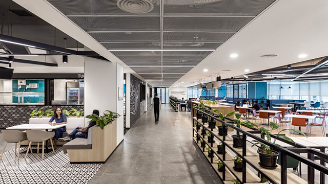
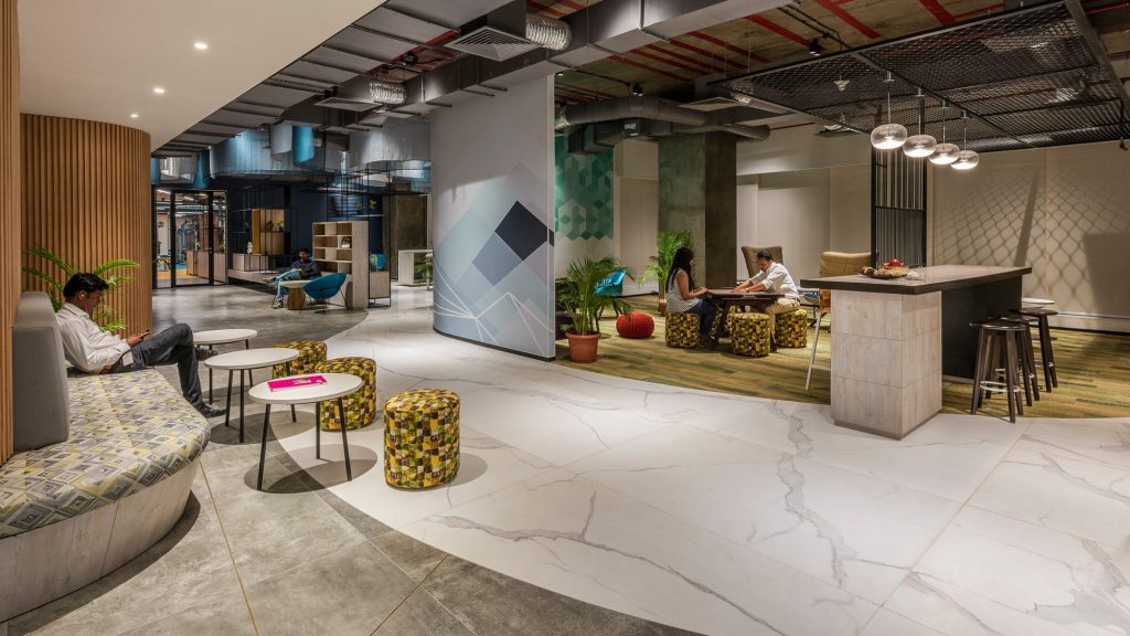
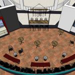
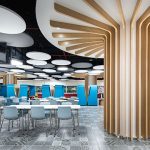
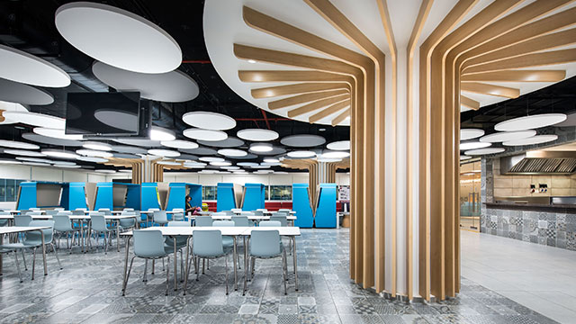
The cafeteria, doubles up as an holding area ,outside of the lunching hours. The thematic treatment of the cafeteria, is a subtle emulation of a tree, with the fluted columns, opening up to the cloud ceiling.

This facility is designed to LEED Gold certification.
Netflix, Mumbai

Prologue

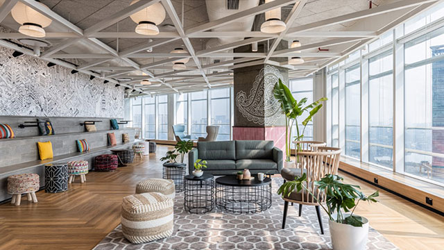
Our storyline celebrates the incredible ‘richness and diversity’ of Netflix as an international brand fused with the India’s enriching culture. In the era of globalization, India remains a land of ‘amazing contrasts’ offering a mixture of both high tech brilliance and archaic splendour.

Our concept encompasses the formation of distinct themes, which are representative of Indian culture, and thereby staging them within a contemporary spatial context. Our aim is to form a whimsical journey reminding the end-users of the rich and multi-layered culture that thrives within this truly global destination.
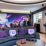
Our strategy addresses how our past informs our future by forming a visual tapestry balanced within three-dimensional space. The aim is to form destinations that offer a sense of affinity, entice the multi-generational workforce to build on autonomy, enhance social networks and underpin Netflix’s global culture.

Koch, Bangalore

Experiencing strong growth in India, American multinational conglomerate Koch Industries needed a regional headquarters that could support its rapidly scaling business as well as Molex’s, one of its subsidiaries, by bringing together both corporate entities within the same development.

This sizeable 5-storey project was split into three sequential phases, with the first and second (now completed) making up 170,000 sqft of flexible, highly dynamic work spaces and social amenities. Supported by our fully integrated design-build approach, Koch establishes a strong foothold in the region to attract the best talents in IT.


Project highlights

  • Considering a 700% staff increase over 3 years since the start of the project, flexibility is a core component of this campus’s design concept
    • Workplace strategy
    • Flexibility
  • It offers a wide variety of space types, providing people with an abundance of settings to choose their preferred way of working and socialising
    • Illustrate different work types
    • Attracting talent – amenities
  • Custom branded graphics visually communicate Koch’s global identity as well as its creative spirit
    • Visuals of branding

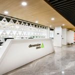
Dimension Data, Mumbai

This story demonstrates:

  1. Sometimes (especially in Mumbai) getting an office space may involve putting many units together. Sometimes there units don’t have building services that work together and sometimes they even have different landlords.
  2. M Moser can be the best source of accurate and unbiased information about the real situation. Sometimes the client doesn’t get the fullest advice.
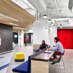
  3. Landlords / developers are often unwilling to share building information until after the lease is signed but M Moser has worked in most buildings and can also actively pursue resolutions in our client’s favor to gather information or agree changes that might otherwise not be allowed.

BNP Paribas, Mumbai

To reflect a single Entity of the Bank and still give the partner company its identity in a single vertical building.

To capture Panoramic View of Mumbai with sea link bridge, as a person enters each floor.

To create Maximum Natural lighting in each floor

To create the Global interior workspace.

Space planning and departmental layout to support the business process Various departments.

Tight time lines and Design Change Request during Execution.

SOLUTIONS:

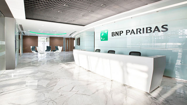
Double height entrance & entire ground floor is proposed as a front office of the entire Bank, to reflect a single entity. Each partner company is designed in one floor/part floor giving them their own identity.

Space planning is done in such a way that open plan workspace is in centre of the floor plate and enclosed offices is on either sides, capturing panoramic view of Mumbai’s skyline with sea link bridge and thereby also getting maximum Natural light in the office.

Creating space with universal space standards and sourcing product globally and locally to create a Global interior workspace. – Program based adjacencies and stacking .

Arrow, Ahmedabad

Communication  made easy

A dedicated M Moser team in Denver to help  communicating with the client’s Global Real Estate  team. We communicated directly with the client in  the absence of a third party project manager.​

Developer interaction beyond  routine project management​

Intensively engaged with the developer for code  compliance and infrastructure fulfilment.​

A successful consolidation  & acquisition project

Mapped requirements and cultures of the principal  company and the acquired business to present a  hybrid work model that would satisfy both.​

Coordination with FM global

Coordinated with clients insurance compliance  team and FM global insurance representatives.​

Special Economic Zone  Project

Coordinated with client’s SEZ Consultant to ensure  the material inward and outward documents are 
maintained as per SEZ documentation requirements.​

Use of transparent  online procurement

Set up digital platforms to ensure smooth and transparent  procurement and project management processes.​

Delivered during  COVID lockdown​

Successfully delivered the site during the first  COVID lockdown.​​​​​

Altico, Mumbai

Altico is a non-banking finance company focusing on senior secured lending for real estate projects in India’s Tier-1 cities. For its new office, the firm wanted to create a tactile work environment to attract talent and support organisational growth. Our design strategy focused on creating a comfortable and familiar setting to capture the connection to home.

At a glance

  1. Design inspired by iconic mid-century industrial architecture to connect to Altico’s heritage.
  2. Using raw and honest materials for a tactile environment.
  3. Efficient space planning helps make the most of the available square footage.

Altico has established itself as a strong brand with a solid foundation, reflected in its slogan, ‘Financing India’s Future’. To translate this identity, we established a home-office design concept with materiality inspired by mid-century industrial architecture. The theme nods to Altico’s roots in lending to the real estate and asset-backed sectors and is expressed through raw bricks, concrete finishes, and exposed ceilings.

To capture a residential aesthetic, plants and greenery bring a natural look-and-feel to the space. Even the smallest details express the overall design concept. In the washrooms, interiors have been revamped in a mid-century style that continues the overall interior design language and supports the user experience.

Because Mumbai has the highest rental prices in India, the efficient planning was another key element of Altico’s workspace design. Totalling 6,000 sq. ft. across a single floorplate, modular planning, helped optimise efficiency for the office. The layout balances collaboration spaces with the need for privacy, encouraging a productive environment that connects the Altico community.

This new office represents our ambition to be a leading financial firm driven by global standards shared by our world-renowned foreign shareholders.

Sanjay Grewal, Chief Executive Officer, Altico

Booking.com, Mumbai

We’ve worked with Booking.com on numerous workplace projects across its global portfolio. For the new Mumbai office, we were tasked with designing and building an engaging space for staff and industry partners to capture local culture and encourage social interaction.

At a glance

  1. A design inspired by Mumbai’s diverse urban fabric for a dynamic, local experience.
  2. Design details bring to life Booking.com’s brand identity through the spirit of exploration and adventure.
  3. Locally sourced raw materials bring tactile, multi-dimensional layers to the workplace.

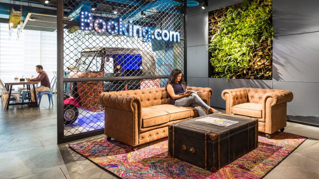
For its new 9,500 sq ft office in the heart of Mumbai’s central business district, Booking.com wanted to draw on its surroundings to connect the brand with the local environment. Mumbai is a city of stark contrasts woven into a diverse urban fabric. Our approach was to form distinct themes that represent Mumbai culture and stage them within a spatial context. This created an imaginative user journey inspired by a day in the life of a ‘Mumbaikar’, a reminder of the rich culture thriving within the city.

The workplace is divided into various themed zones inspired by specific Mumbai cultural and social identifiers. The journey begins in the reception, in a typical street market with novelties including an ornamented auto rickshaw and a bespoke cut chai glass chandelier in the cafeteria. Interior spaces use repurposed shipping containers, inspired by the new Mumbai high-rises using them for high-density urban housing. Materials were sourced locally whenever possible, including raw finishes and patinas.

The smaller meeting rooms are furnished with photographs of locations Booking.com employees have visited. Besides adding a personal touch, these design details blur the line between work and passion. Meeting rooms and individual offices draw inspiration from popular holiday destinations, with an emphasis on exploration and adventure. Weaving together this visual tapestry are ‘Grunge’ supergraphics of Bollywood and cricket stars throughout the office. Together, this graphic collage represents Mumbai’s multifaceted culture, including emblems of prominent architectural relics and the Hindi alphabet.
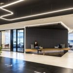
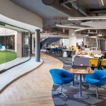
The new Booking.com Mumbai office was designed and constructed in just 60 days. To meet the condensed timeline, we developed a streamlined project management system for timely client approvals at each stage. We also carefully monitored the procurement process for smooth transition from one phase to the next.

Yes Bank, Mumbai

Yes Bank’s mission was to be the finest bank in India. It also recognised the importance of investing in employee experience. To further support this goal, the company set out to create an additional floor at its Mumbai headquarters with spaces that would support employee empowerment, health and wellbeing. M Moser was selected to design and build the new floor.

At a glance

  1. Showcases an innovative new design style away from a generic banking environment.
  2. Maximises employee wellbeing and empowers employees within the five distinct areas.
  3. Uses future-forward design to encourage staff productivity, helping Yes Bank achieve its goal to become an industry leader.

Work began with a design strategy workshop between to generate fresh new ideas beyond the typical banking space design standards. Findings were then summarised into an objective. Yes Bank wanted a new space to showcase its digital and compassionate company culture. Staff wellbeing and employee empowerment would be key.

The design features five areas, each with a distinct function:

  • Entrance
  • Yes Club
  • Mindshare Garden
  • Pep Centre
  • Prosperity Lounge

Entrance

This is an expansive front-of-house communal area for relaxing and collaborating in a casual setting.

Yes Club

A space where employees can focus on their mental and physical health. It has a state-of-the-art gym, spa, mother’s room and sick room. There is also a multifunctional area for informal meetings, coffee breaks and games.

Mindshare Garden

The Mindshare Garden is a venue where senior leaders can host town hall meetings. It also has a breakout area for staff to share ideas and collaborate. The outdoor café design with ambient floor lighting lends itself to the natural atmosphere of the space.

Pep Centre

This area is designed for training and holds 264 seats. It’s a dynamic and flexible space which can also be split into smaller rooms with partitions. The space has an aquamarine and grey palette with wood finishes.

Prosperity Lounge

The Prosperity Lounge fully captures the hospitality theme, functioning as a versatile space for hosting guests. Residential furniture and warm wood tones create a comfortable and familiar look-and-feel.

Through close collaboration with Yes Bank, we built a new floor that puts staff wellbeing and productivity at its core.

NBA, Mumbai

With a significant fanbase across India, the NBA set out to create a new Experience Centre in Mumbai. It wanted to build a closer connection with local audiences, and increase awareness of the game and the NBA brand. We were engaged to design the Experience Centre along with a new workplace that would reflect the youthful, athletic, and lively culture of the league.

At a glance

  1. A design that captures the lively essence of basketball.
  2. Increasing engagement with the sport across multi-functional spaces.
  3. Showcasing memorabilia and player profiles to build brand awareness.

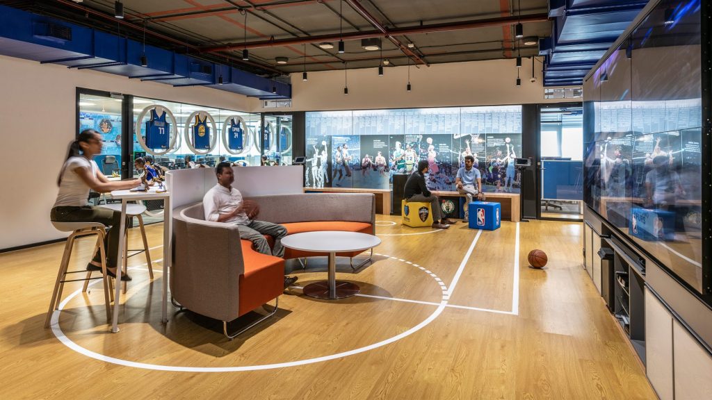
NBA’s Mumbai Experience Centre builds and promotes awareness about basketball and the NBA brand. Designed for up to 60 people, the space is an arena and forum for small events and a hosting space for visiting players. It’s also a showroom for senior marketing and brand leaders supporting corporate partnerships with the NBA. A fast-paced sport that requires great speed and agility, the team needed to look no further than basketball for design inspiration.

Basketball has a committed following of 17 million in India, many under the age of thirty-five. Combining the energy of the game with a futuristic and connected workspace, the NBA Experience Centre celebrates the sport and its heritage. It offers a unique journey for employees, visitors, and fans.

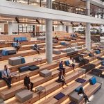
Using information to bring people closer to the game, the space has bleacher seating and iPads with flip screens featuring player images and profiles. Merchandise displays showcase basketball memorabilia such as jerseys, footwear, basketballs, and other branded gear to create connection to the brand.

To meet NBA’s goals of happiness and fulfilment, employees are encouraged to interact and play between work. Balancing collaboration with focus, the workspace offers a range of settings to support different needs.

The idea is to offer a behind-the-scenes experience to Indian fans. Coming here would be a ‘money-can’t-buy’ experience.

Siddharth Chury, Associate Vice President, Global Partnerships, NBA

M Moser In India