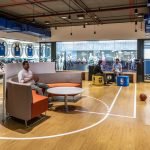
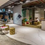
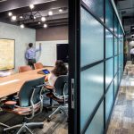
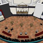
Citi, Chennai

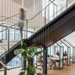
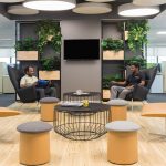
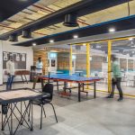
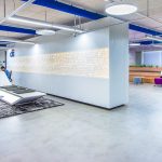
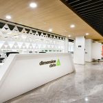
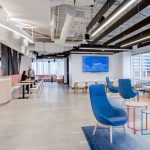
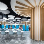
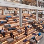
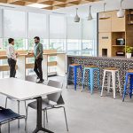
Multinational investment bank and financial services corporation Citi, needed a new office in India to help it adapt to fast-evolving changes in the industry. We designed the 69,000-sq-ft space as a scalable, technologically-advanced workplace, drawing in skilled digital talent and supporting long-term business goals.

At a glance

  1. Digital innovations and technology empower staff to take control of their workplace experience.
  2. The office prioritises scalability and health through activity-based working and wellness design.
  3. Post-occupancy studies report an increase in productivity, collaboration, and social connections.

Named ‘Citiworks Enterprise – Workplace of the Future’, this new India office is a pilot space where Citi teams can experiment, innovate, and provide continuous feedback on new ways of working. The goal was to challenge expectations of the traditional banking environment and advance the organisation as a forward-thinking industry leader. Free from enclosed private offices, this was Citi’s first global workplace to embrace the open plan. Encouraging the transition, our change management team worked closely with Citi staff to educate on new office functions and technology.

Using digital innovation to increase efficiency and improve the experience was key. We collaborated with Citi’s technology partner to create a complete cloud infrastructure synchronising all physical and software devices. This included a ‘Citi App’ for staff to control their workplace experience. The app allows people to book seats and view availability of meeting rooms in real-time; access an internal wayfinding system; adjust temperature and lighting in enclosed spaces; manage office visits remotely; and provide feedback. The digital cloud infrastructure also features smart lighting technology (including LiFi and Power over Ethernet); occupancy and desk sensors; and HVAC controls.

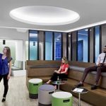
Offering an agile working model arranged by neighbourhoods, the workplace has a variety of environments and reconfigurable workspaces that can adapt to changing needs. Height-adjustable desks, booths, and bike stations encourage movement. Independent meeting pods with A/V, lighting, and ventilation systems can be demounted to create an open collaboration space for larger team gatherings. Carefully designed acoustic settings help reduce noise, along with ergonomic furniture in all seven of the office’s seating configurations.

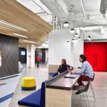
In the main entrance, a spacious reception connects to an open town hall area called the ‘Plug Zone’, which features a large digital wall to share announcements and innovations. By contrast, the ‘Unplug Zone’ is tech-free, with green walls, plants, and natural materials. Fabric ducts in both zones improve air quality, monitored on information screens in each neighbourhood.

A survey conducted six months after opening revealed significant improvements. Staff flagged wellness elements including sit-stand desks and greenery; increased social interactions; comfortable, lively spaces; and the overall improved look-and-feel of the office as major contributors to an innovative, scalable workplace.
TiVo, Bangalore

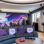
Working to create the next generation of entertainment, TiVo prioritises innovation and technology to deliver varied and rich visual experiences to customers. For its new Bangalore workplace, TiVo wanted to share its brand values and inspire employees to revolutionise the way users discover content. Mixing dynamic and functional work areas, we created a home-like working experience.

At a glance

  1. Inspired by residential elements, the design balances privacy with spaces for community interaction.
  2. New ‘idea zones’ help promote engagement and innovation.
  3. Multi-functional spaces offer the flexibility to meet changing user needs.

Located in a special economic zone (SEZ) campus, the Bangalore office is TiVo’s largest outside of the US. As a fast-growing business, flexibility has been key to success, and the design of the new workplace. TiVo’s culture and people thrive on versatile ways of working, so we designed a space that provides settings for quiet focus, collaboration, and casual interaction.

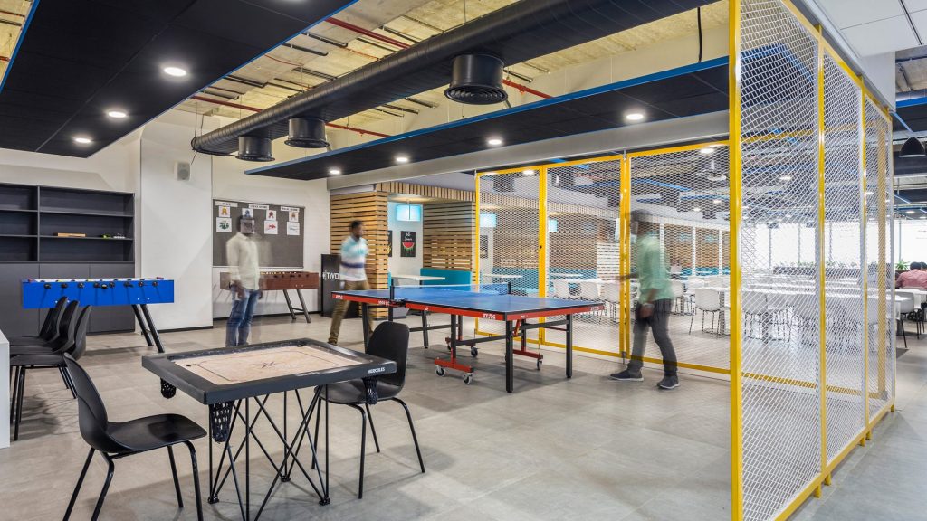
Beginning in the reception, warm wood tones and natural light offers comfort and familiarity. A free-standing, glass structure called the ‘TiVo House’ serves as a tête-à-tête space, similar to a central community living room. Creating a memorable first impression, this unique space is a functional place for visitors and employees to connect. To inspire employees and encourage teamwork, we developed ‘idea zones’, or rooms to promote creative thinking and innovation. These spaces encourage movement, featuring clustered seating at the centre to offer  360-degree views. They also include writable wall surfaces for brainstorming and glass façades for transparency. The spacious cafeteria has diverse seating options, including booths, informal breakout spaces, and individual tables. Encouraging social interaction and play, the space also includes a recreational zone with board games, writable surfaces, and a digital console.

The work areas are defined by an eclectic mix of locally sourced materials, graphics, and textures, creating a lively work environment that draws inspiration from traditional Indian art and handicrafts. Distressed wood panelling adds a warm, rustic character, while patchwork fabric panels with bright colours and traditional patterns create dynamic texture. Handpicked sarees locally-sourced from a Jaipur-based vendor decorate the main boardroom, and sheer curtains bring light into the space. TiVo’s geometric patterns are peppered with regional cultural design elements for a localised global brand identity.

Renault-Nissan-Mitsubishi, Chennai

At its Chennai workplace, automotive partnership Renault-Nissan-Mitsubishi (RNM) wanted to transform the working culture from traditional and mechanical to dynamic and collaborative. With a sizable 900,000 sq ft space spread across three buildings and eight floors, the new design would have a major impact on the organisation and its staff. Key goals were to improve efficiency and synergy between the three partner companies, and to achieve an open, bright space that would engage and retain workers.

At a glance

  1. Enabling a collaborative culture with a new open-plan arrangement.
  2. Aligning the brand experience by uniting three companies.
  3. Taking an economical approach to achieving a high-value, impactful space.

In updating its 900,000 sq ft workplace, the RNM alliance had two key objectives:

  • To improve efficiency by combining the strengths of all three companies, developing synergies, cross-company teams, shared platforms and components.
  • To create a brighter, more open and engaging space that would attract and retain a younger workforce.

RNM wanted to transition from mechanical to collaborative. This called for an open office design to encourage interaction across departments.

We re-planned the space to include open office seating with ‘collaboration intervals’ and areas such as an amphitheatre meeting room, focus booths, and breakout zones to encourage informal and open discussions. The main entrance on each floor has been transformed into a centralised area, where employees can gather for group discussions or a short break. To maintain privacy, we used acoustic materials, noise cancelling, and privacy panels in the collaboration areas. Storage cabinets also serve as partitions between open seating and collaboration spaces.

The building houses three different brands, but RNM didn’t want to include any specific brand colours. A balance of accent colours and textures brings energy into the space and helps integrate the teams. RNM’s products incorporate high design, yet remain affordable. We used this company value to deliver an impactful yet economical workspace. Engaging a single contractor, using quality-oriented and value brands, and refurbishing existing furniture helped us deliver an efficient, yet quality design.

In line with RNM’s values of innovation and technology, we developed a zone for promoting ideation, innovation, and concept development. This new ‘design studio’ encourages movement with a single cluster of desks at the centre. Wall-to-wall writing surfaces and space to display research supports seamless discussions. An adjacent auditorium for town hall meetings serves as a global virtual forum to interact with teams from around the world. The auditorium has 350 seats with an advanced AV system, while addressing acoustics. The cafeteria has a capacity of 450 with a live kitchen. The main challenge was controlling noise intensity during lunchtime, so we designed the space in an L-shape and used acoustic panels.

Global Media Company, Mumbai

The main goal for this global media company was to create a dynamic, inclusive and brand-led destination for its first purpose-made hub in the Indian market. Meaningful local references help develop connection while reflecting local values and culture. This immersive environment is an inspiring space that welcomes employees back. Thus, acting as an invitation for the local market to experience the brand.

At a glance

  1. A vibrant destination to promote the brand in an emerging market, attracting and engaging talent, creatives and the wider community.
  2. Celebrating the rich cultural heritage of India to create a memorable workplace experience.
  3. Supporting diverse individual needs by offering choice, comfort and a sense of wellbeing.
  4. Curating a creative and inspiring user journey infused with local art and branded touchpoints.

Problem-solving through design

The existing site was a challenging, novel commercial space with deep internal pockets. Initially, it provided no access to external views or natural light. So, our design solution was clear and compelling. A unique plan that supports the client’s ambitious functional needs.

Internal and back-of-house functions like storage, server rooms and kitchens sit in a central block. We made the core a feature, cladding it in black engineered metal. Then, the long entrance transforms into an ‘Audio Tunnel’ experience. This passageway features a colour-changing LED installation. Additionally, audio content paves the way toward the company logo in neon, a signpost.

The logo wall adds to the entry experience, contrasting with the black architectural mesh of the core. Immediately, this space opens up to a window in the dynamic, hi-tech reception area.

Capturing diverse local culture

Moreover, inclusivity was important given India’s rich cultural heritage and diverse languages. So capturing the essence of local, warm and welcoming was key to attracting audio creatives and talent.

The central community space reflects the Angan or open courtyards in traditional Indian houses. Upon entering by the reception, there is a light-filled space that offers casual lounge settings.

Following that area, the public meeting areas and the Work Café supports different activities. Then, the Aangan transforms internal events. For example, training and townhalls along with public performances and launches.

A place like home

The Divan, beside the Aangan, takes after the Divankhana, as an intimate and relaxing area. Therefore reflecting the hosting of guests in a traditional Indian home. So, the room is for work, rest or play.

Moreover, the multi-use space is dividable from the Aangan for privacy with contemporary Jaali sliding screens. Specifically, the materials and colours of both the Aangan and Divan, express the regional aesthetic. Additionally, they drive greater social connections, which support comfort and wellbeing. Overall, the spaces create a warm and memorable welcome and encourage spontaneous conversations.

Spaces for creativity and innovation

The result is an agile workspace for an innovative company with a progressive culture. So, the space fits the various needs of both teams and individuals. Additionally, it offers different modes of work to encourage creativity and innovation.

In particular, there are quiet spots for focused work and open, casual settings for collaboration. These combine with enclosed meeting rooms for presentations. Reset spaces for relaxation line the windows, and sit-stand workstations benefit from plenty of natural light.

A cultural brand-led experience

Graphics, installations and art pieces convey a sense of the company’s culture and values. For instance, the reception artwork shows people of various lifestyles lively listening to digital content. Also, the Aangan features drumheads from Indian percussion instruments. All spelling out ‘Hello’ in different Indian languages and scripts. Further representing audio, shared culture and a universal welcome.

Finally, the boardroom and listening room have striking wall and ceiling patterns made of Indian classical music. Altogether, conveying the brand while engaging the local creative community.

Overall, drawing on home comforts we all know, this global media company’s Indian hub puts wellbeing first. A welcoming world-class space. One that encourages connection, celebrates the culture and focuses on the future.

Following from its Singapore office, the project continues our relationship with the client.

Accenture, Bangalore

Accenture is an enterprise management and consulting services company. The core objective for the new Bangalore Innovation Hub was to support its people to rapidly prototype, and adapt clients’ businesses to the digital world. Innovation is defined as the creation of something new to meet a need. We designed the new space to be future-ready, collaborative, stimulating, and progressive

At a glance

  1. 425,000 sq ft facility that supports innovation and the creative process.
  2. A progressive, future-focused workplace that highlights the company’s past to help shape its future.
  3. Functional, futuristic workspaces for teams to innovate under the larger Accenture umbrella.

The main challenge was to identify the needs of Accenture’s individual business units. The team helped define these needs through discussions, interviews, and leadership focus groups. The space caters to Accenture’s five operating groups: Communications; Media & Technology; Financial Services; Health & Public Services; and Products and Resources. To accommodate each group while encouraging a unified whole, the design includes ‘satellite hubs. These serve as interaction points where each unit can showcase its unique vision and successes. Each unique zone includes the specific space functions and technology required for the unit while also remaining connected to the rest of the design.

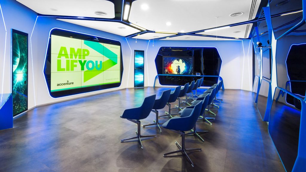
Fusing Accenture brand values with agile spaces and interactive technology creates an immersive user journey through the building’s spine. The space consists of two towers spread across thirteen floors. To enhance physical connectivity and movement between floors and buildings, we defined a distinct circulation flow. We also converted some of the service lifts into VIP lifts for an uninterrupted flow of vertical movement and walkthrough.

The user journey begins in the Innovation Gallery which showcases the future of IoT and Accenture’s history of innovation. Next, users encounter the ‘Time Capsule’, a hosting space for live presentations, before entering the ‘Interior Workshop Lab’. Here, visitors can virtually witness the journey of an application, from conception to execution. Several floors in the ‘Innovation Hub’ are dedicated to the research and development of emerging technologies.

The ‘Garage’ fuels thinking and creativity, with a wide variety of seating options, writable surfaces, and team table options to encourage brainstorming, ideation, and innovation. The ‘Innovation Hub’ also includes top-class facilities such as a spacious cafeteria with diverse seating options, recreational areas with a fully equipped gym, and multiple pantries on each floor to cater to its 4,000-plus employees.

Cook Medical, Chennai

Cook Medical is a global medical device company that supports patient recovery and offers doctors simpler, more effective options. For its sixth project with M Moser, Cook Medical wanted to implement modern design standards in Chennai to support agile working and collaboration.

At a glance

  1. Transforming the way people work by moving away from cubicles and enclosed offices to an open, agile layout.
  2. Supporting an organisational shift towards economic goals and employee health and wellness.
  3. Creating a state-of-the-art warehouse to improve logistics management.

As an important region for Cook Medical in Asia-Pacific, the company wanted to transform its local facilities in Chennai into a modern, integrated office and warehouse that would support future needs. Home to the sales and operations teams, the focus was to encourage collaboration through agile working and prioritise health and wellbeing. To do this, Cook Medical needed to redefine the Chennai workplace.
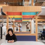
Design elements focused on privacy create a smooth transition from the traditional office with private cubicles, to a more open-plan setting. These include phone booths and separation planters that offer flexible areas for focused work. Versatile arrangements support diverse individual and collective needs, including team-based agile neighbourhoods. The new open-plan office encourages employees to pursue common goals through collaboration with large pantries, interaction areas, and playful facilities.

Training facilities feature the latest video-conferencing technologies and support collaborative, interactive learning. Details like beehive-style graphics share business values and promote team spirit. A multifunctional space that can be repurposed for town hall meetings and company gatherings has movable furniture and an extendable projection wall, for ultimate flexibility .

Aligning with WELL standards following our work with Cook Medical in Hong Kong, the new office introduces green design and plenty of natural light. Material selection meets the highest standards of sustainability, from carbon-neutral flooring to LED lighting and energy-efficient ventilation. Height-adjustable workstations prevent prolonged static posture. Parenting rooms and open terrace seating offer further levels of comfort. Following modern benchmarks in logistics management, the warehouse includes epoxy flooring, controlled temperature, and blackout screens.

The new logistics centre will ensure prompt delivery to our customers.

Vijayan Govindaraman, General Manager, Cook Medical – India

The new space supports a much needed shift for the business and its staff, increasing motivation and productivity. The design helps Cook Medical meet economic goals by putting employees and their needs at the heart of the project.


Accenture, Delhi

For its new facility in Aerocity, Delhi, enterprise management and consulting services company, Accenture, wanted a high quality space to host business leaders from across the globe. The workplace needed to rival other top international consultancies, setting a new benchmark. We answered this need with a design that is both flexible and progressive.

At a glance

  1. A future-focused workplace for innovative thinking and cross-business collaboration.
  2. A dynamic and flexible arena for Accenture to engage with customers and its India operations.
  3. Seamless connection between interior and exterior helps localise the workspace.

While only a portion of Accenture’s leadership and support teams are assigned to the Delhi office, the space serves as a touch down point for regularly travelling clients and other business leaders. We proposed a versatile design for this dynamic user group. Spread over 20,000 sq ft, the design includes assigned and agile seating, breakout areas and multifunctional spaces for focused work and informal discussion.

Flexible, adaptable spaces such as assigned work cabins double as meeting rooms when occupants are travelling. The efficient ‘Work Café’, which occupies approximately 20% of the total square footage, caters to staff and visitors. It is also a welcome respite away from the desk, and a venue for informal meetings. The workplace also offers scenic views with a large outdoor terrace with seating for large and small groups. We designed the terrace as a continuation of indoor offices, using a design language in line with the interior.

A key design concern was creating spaces to support Accenture’s business ethos of innovative, progressive thinking. To bring this philosophy into the workplace, we developed a Design Thinking Zone. This space enables Accenture consultants to work with business leaders in a ‘War Room/Project Room’ setup  – a hub that supports the studying of digital information and the formulation of action plans. The zone is furnished with a connected, interactive screen and writable surfaces for strategic dialogues.

Making the most of its location, the workspace prioritises agile and flexible spaces. Sited just ten minutes from Delhi’s international airport, the office helps business heads and clients avoid the tedious inner-city commute. This also allows visitors to make the most of their workday by flying in and out with minimum travel time.

Titan, Bangalore

Titan is Tata’s largest consumer goods company with more than 2,000 stores in over 30 countries. Its new Bangalore headquarters celebrates its unique business model and community focus. Titan’s vision was to develop a dedicated place to support the expansion of its product ranges and support business growth. The new workplace elevates experiences, nurtures culture and creates a sense of belonging.

Project highlights

  1. Creating elevating experiences to nurture culture while fostering warmth, energy, and sense of belonging.
  2. A network of collaborative work settings enables easy access to functional spaces that support the workday.
  3. Embracing sustainable design to reduce the project’s carbon footprint.

Supporting Titan’s focus on people, the site is planned as a ‘mini-city’ with world-class facilities. Offsetting its relocation from Bangalore’s Central Business District, the space features a gym, cafeteria, crèche and more. Blurring the lines between hospitality and work, it encourages innovation through its ‘flat hierarchy’ and flexible working opportunities.

We create elevating experiences for the people we touch and significantly impact the world we work in. We will do this through a pioneering spirit and a caring, value-driven culture that fosters innovation, drives performance and ensures the highest global standards in everything we do.

Bhaskar Bhat, Managing Director, Titan

We brought Titan’s vision to life by hosting interactive workshops, interviews, focus group activities and design discussions. Corporate values played a significant role in determining the design language for the new campus, including:

  • Total Customer Orientation
  • Employee Appreciation
  • Performance Culture & Teamwork
  • Creativity & Innovation
  • Passion for Excellence and Corporate Citizenship.

Ramesh Subramaniam, Director for International Design, shares, “We took Titan’s six business values and translated them into something tangible, forming the basis of the design language. In this case, the defined form of a hexagon. This became the representative element connecting various spaces to connect the architecture with the collaborative workspaces within.”

Entry spaces are designed using a natural palate of materials for a seamless transition into the reception area. An eclectic mix of materials and textures in meeting rooms, training spaces and the innovation centre bring a welcome energy to the space. Translating the language of the surrounding landscape, the café creates a warm experience with colourful highlights.
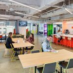
Workspaces are defined by a hexagonal lighting feature, a subtle reminder of the company’s values. An exposed high ceiling creates strong connections with the verandahs and outdoor environment.

Enclosed areas such as meeting rooms, quiet rooms and cabins are designed as islands in a sea of work settings. Timber is used within these zones to add texture and warmth, while colourful, natural materials define departments.

Natural light connects interior and exterior. Lighting fixtures flow with the building shape and linear lights increase reach over workstations for maximum comfort. Ceiling fans move natural air so that air-conditioning is not required. To reduce the project’s carbon footprint, most of the materials and design elements are made locally in India.

The ‘jewel box’, takes its name from its form – enveloped in glass and floating over still water. The interiors mix deep blues with natural browns across a variety of high-spec lounge and meeting spaces. The Managing Director’s office brings in spectacular views of the lake and surrounding structure.
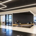
Atrium spaces are a celebration of light and colours that represent nature. Natural light enters the skylight and falls into the atrium, accented by soft blue hues and highlights of yellow and green.
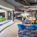
Titan’s new headquarters is a pioneering workplace that pushes the boundaries of human-centric design to set a benchmark in India and beyond.

Standard Chartered Bank, Bangalore

Standard Chartered Bank (SCB) needed to expand its Bangalore campus to house its data, robotics and software development teams. Adding more floors and a social hub, the focus was on exploring a new design language, pushing creative boundaries, and attracting talent. SCB wanted to encourage innovation by better connecting its technology and finance departments.

At a glance

  1. Increases productivity by supporting SCB’s agile and flexible way of working.
  2. Blurs boundaries between technology and finance departments to create an innovative ‘fintech’ culture.
  3. Uses a flexible, energetic environment to attract and retain talent.

SCB had steadily outgrown its 400,000 sq ft Bangalore building as it lacked a reception area and large-scale meeting space. Establishing a new social hub at the heart of the campus to support culture and community was a key goal for the new space.

The campus now has a welcoming, impactful reception area. Connected to a bistro-style cafeteria and business lounge with sweeping views, the space is designed for collaboration and relaxation. Staff can also access a multi-functional training centre to support their learning and development.

Two floors are dedicated ‘sprint zones’ for SCB’s Technology Department, where groups of 8-12 people can work efficiently together. Each zone has state-of-the-art digital and collaboration tools, breakout areas, touchdowns and meeting hubs. Staff also have access to quiet rooms, phone booths, wellness rooms and mother’s rooms. Signage to these areas is clear with elaborate colours and murals to improve the experience.

This new workplace design allows SCB to create a rich workplace culture and embrace its diverse community of clients and staff.

Our new Bangalore office is market-leading. I’ve been to many workplaces in many countries and this is undoubtedly one of the best environments I’ve ever seen.

Scott Barras, Regional Head of Property, ASEAN & South Asia (ASA), Standard Chartered Bank

PayPal, Bangalore

After collaborating with online payment company PayPal on numerous projects across the globe, we were engaged to design and build the company’s 330,000 sq ft workplace relocation project in Bangalore. The new office not only reflects PayPal’s brand, but supports key staff behaviours of collaboration, innovation, wellness, and inclusion.

At a glance

  1. Capturing the essence of a Californian tech start-up in a space that supports entrepreneurial working. habits.
  2. Indian-inspired street art locates the space within its cultural setting and supports brand identity.
  3. Developing the workplace as a resource to attract and retain talent.

Recapturing the energy and creativity of PayPal’s early start-up days, the space is inspired by the company’s origins as a Californian tech company. At the core of the office sits a small incubation area for hosting start-up ventures. Here, amphitheater style seating encourages innovators to connect and collaborate. Nearby, a designated ‘Innovation Lab’ supports the development of new technologies, and the ‘Experience Research Centre’ is a space for analyzing customer perceptions to develop business strategy.

The rest of the workspace houses the online payments technology team across two floors, and the customer support team across four floors. Tech start-up design elements including ping pong tables, vibrant colours, and bold textures. A loft area contains plush sofas and custom art created in concert with a Californian art consultant and a range of local Indian street artists. Art is used to connect the brand to local culture and engage internal teams through emotion and storytelling.

A key goal for the workplace was to serve as a resource to attract and retain talent. To answer this, we designed all eight floors in line with PayPal’s entrepreneurial, diverse culture. Inclusion and wellness are central guideposts –  diverse workstyles and space types feature throughout. Inspired by residential design, the workplace offers a welcoming, cosy experience. A world-class cafeteria serves 24/7, and a roof terrace with a cricket pitch doubles as a yoga area. The space provides access to natural light and greenery supporting productivity and mood. There are also dedicated areas for rest. Informal settings encourage interaction and teamwork, to support innovation. Breakout areas with AV provisions and stepped seating offer a place for informal team sessions, training, or casual conversation.

The project was delivered from design through to construction for a remotely located client. The team carefully managed construction activities while the first floors remained in operation. The schedule was broken into three phases and adjusted to evenings and weekends for minimal disruption. Live-feed cameras were installed to share ongoing progress with the client.

Our new Bangalore facility is a way for us to send out a clear signal to the market – we are here, we are hiring in big numbers, come and join us.

Guru Bhat, VP Customer Success Platform, GM, PayPal – India

M Moser In India